Context
As the project lead I was tasked with improving our online checkout experience, which was our main source of donation traffic.
Deliverables & Objectives
Increase sign ups
Improve Desktop experience

Product Analysis
Identifying weak points, gathering an understanding of where the current product sits and missed opportunities.
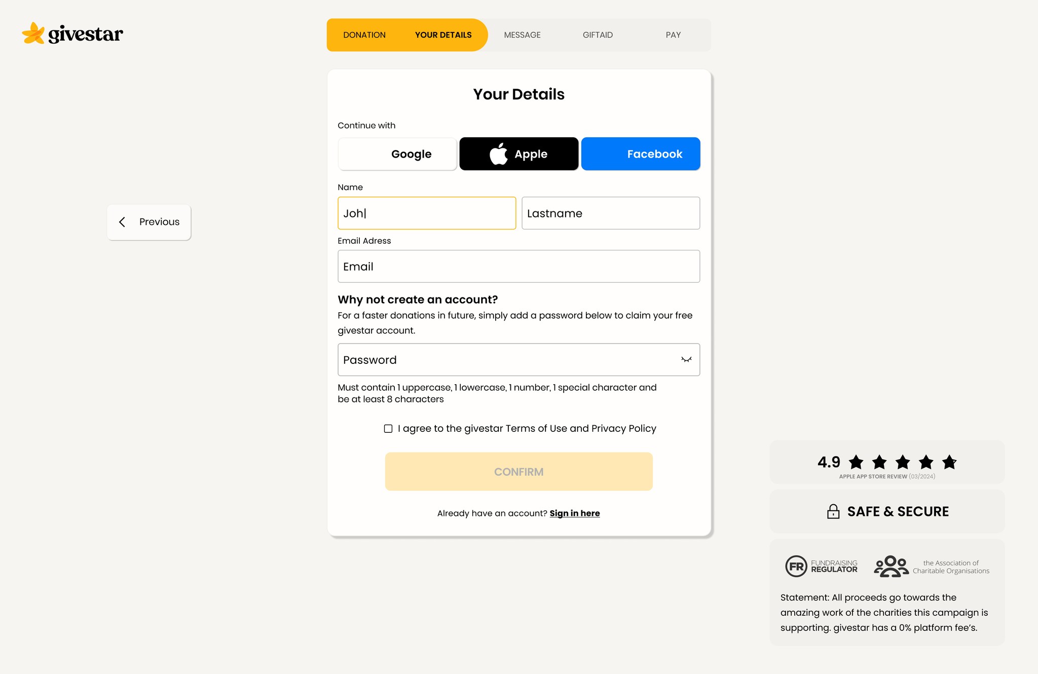
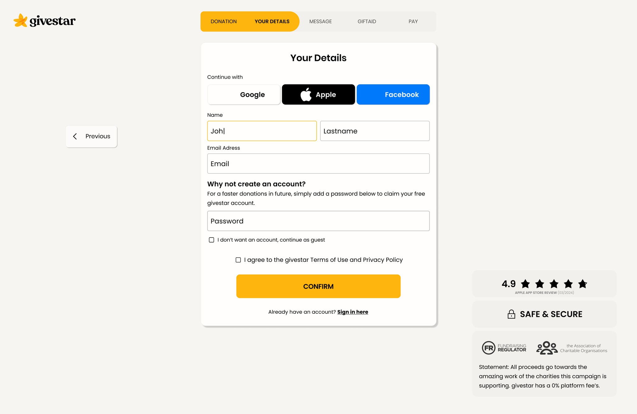
Current sign up prompt
1
Current sign up cta can be easily missed with value proposition or forced interaction.
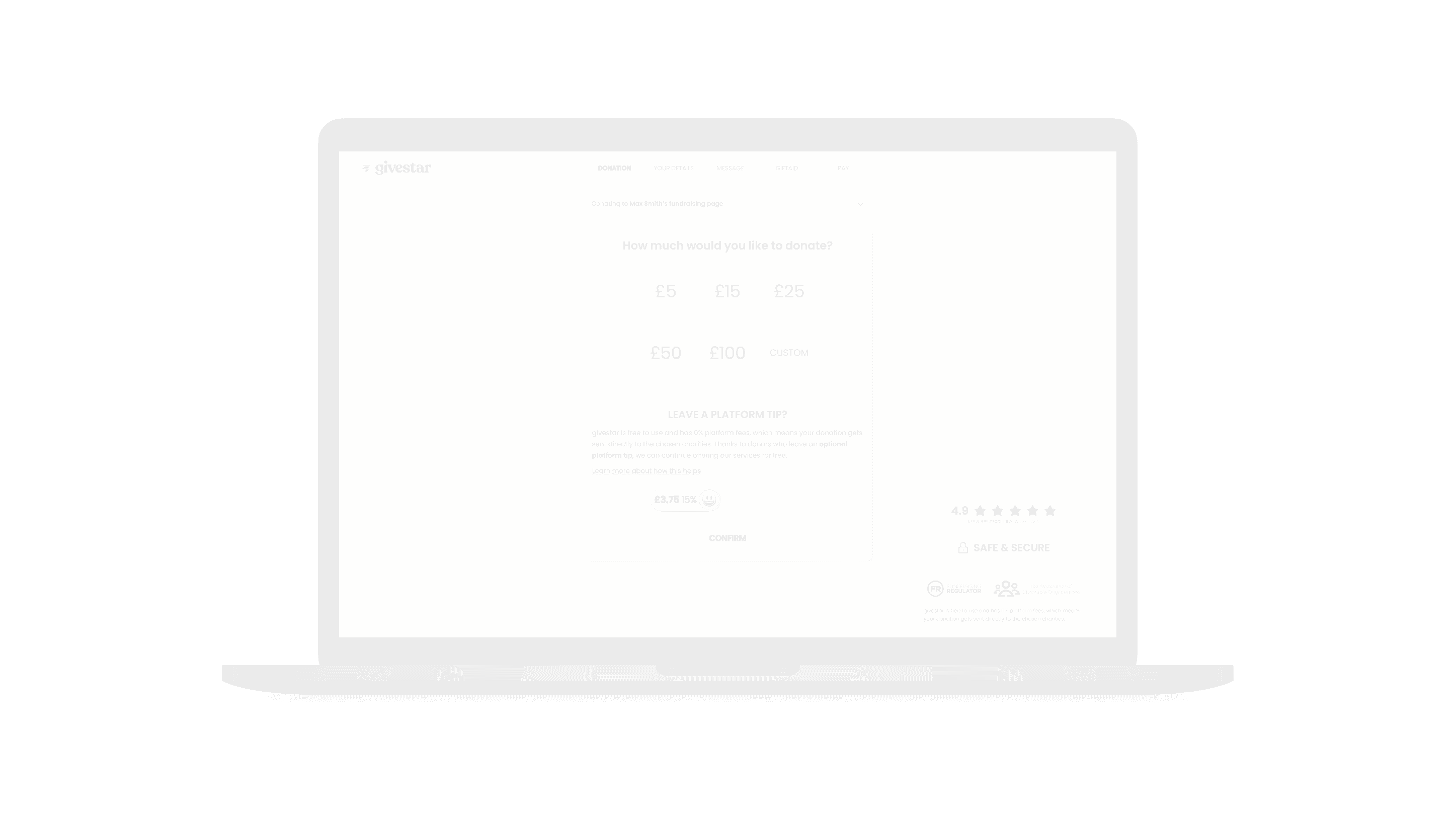
Donation process
2
Trust, user's can feel easily lost and without confidence they're where they need to be.
3
Values are too high, user's can feel easily deterred. Users want to feel rewarded.
4
Long forms with no progress check can kill engagement and make short tasks feel longer.
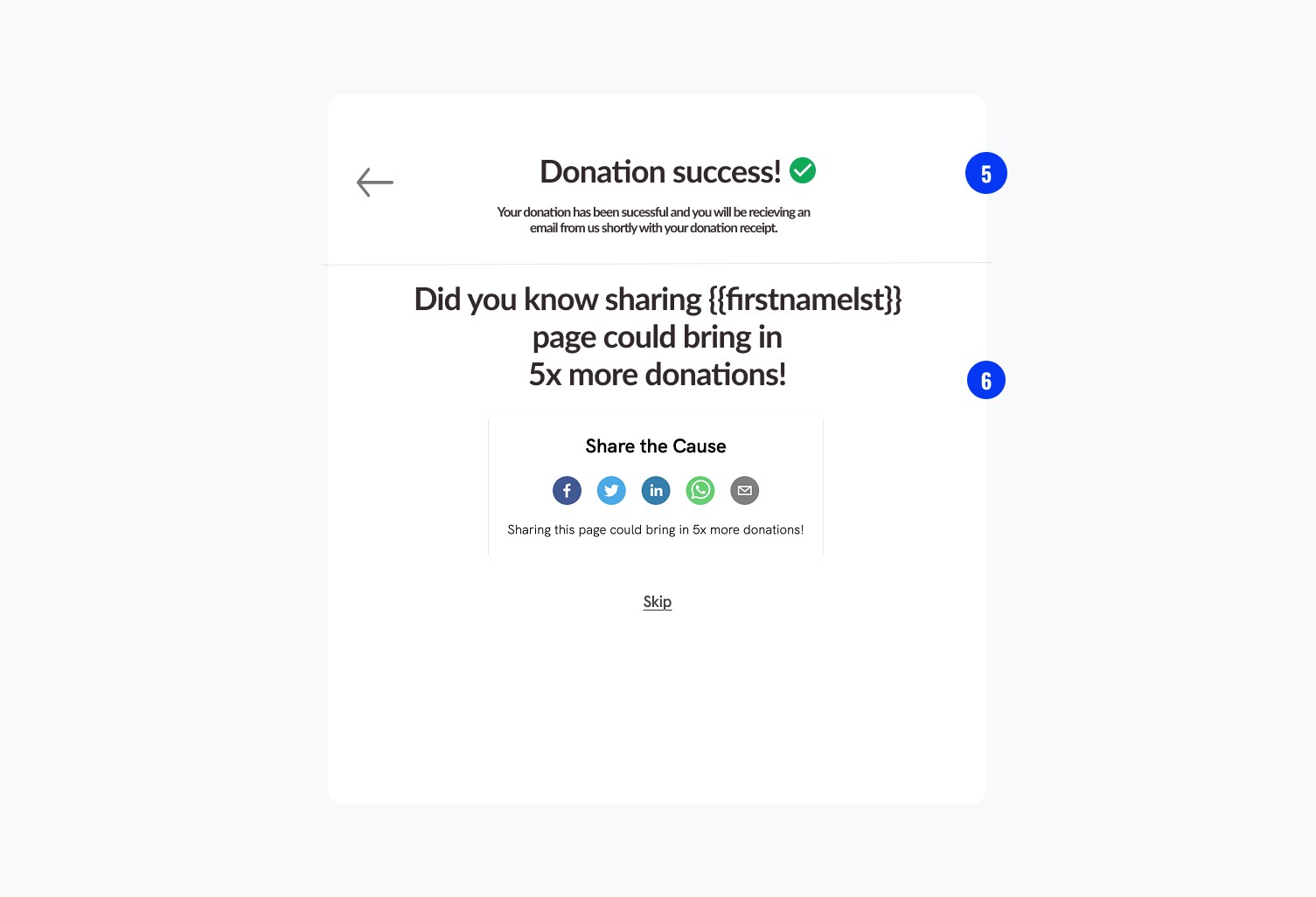
Success screen
5
Despite being clear, this is another missed opportunity.
6
Powerful messaging but weak UX copy with little pull
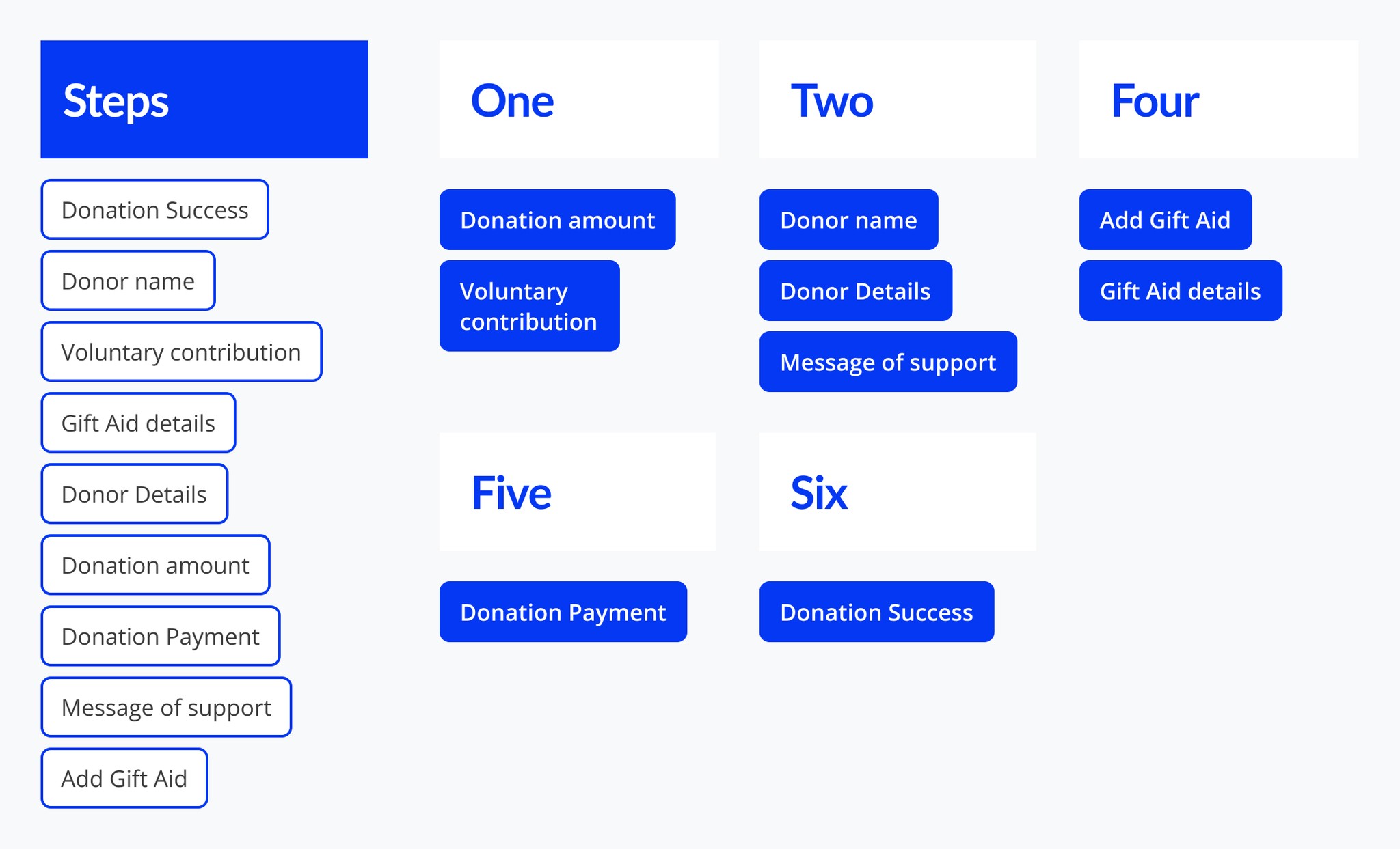
Card Sort

User testing


Steakholder feedback
Final Delivery
Donation Amount

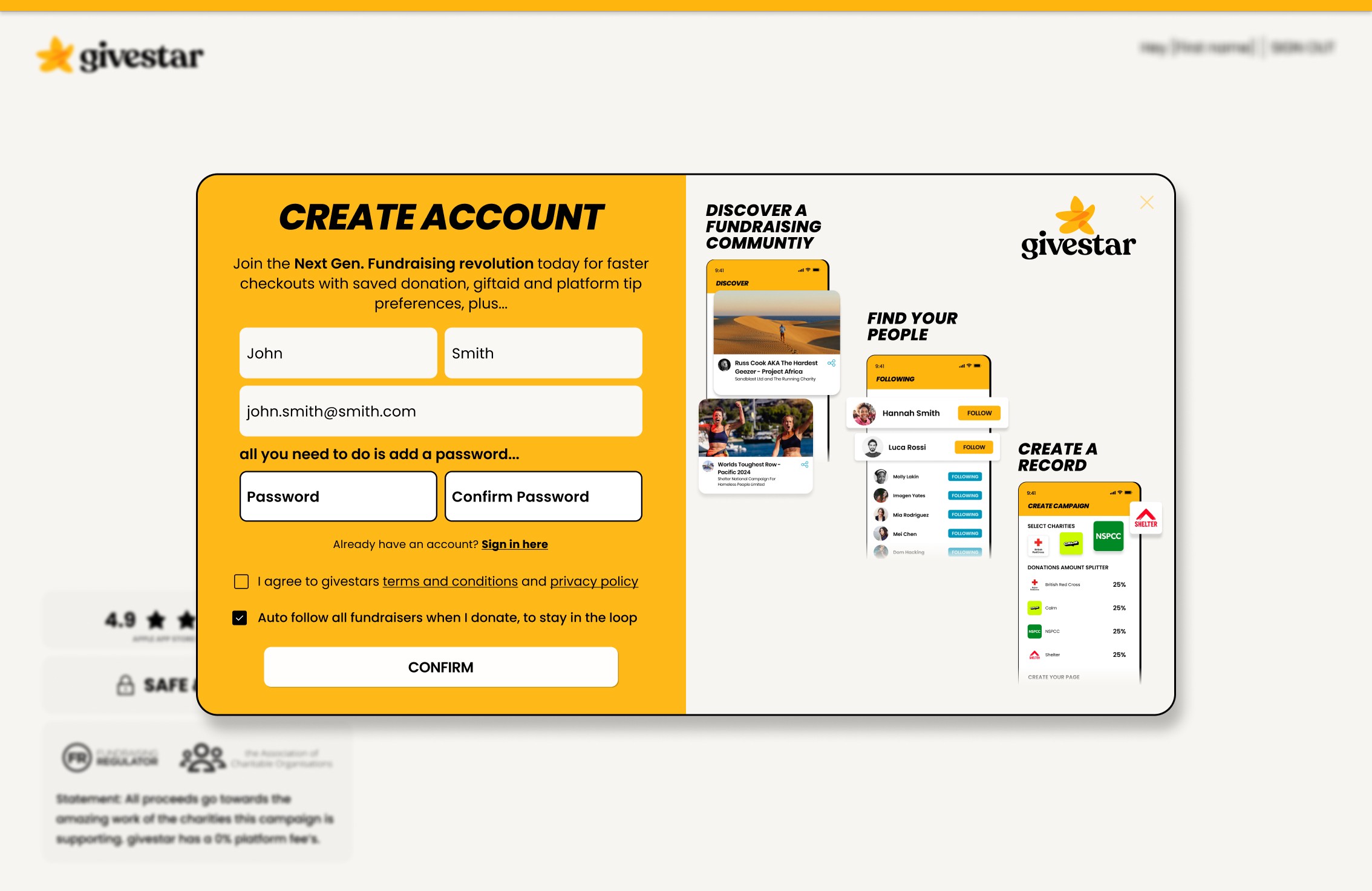
User Sign up
Gift Aid Declaration

Outcome
10k
Monthly sign ups
28%
Increase in average donation